


Vineyard Theatre Logotype
The Vineyard Theatre is an off-Broadway theatre company in New York City, dedicated to developing and producing new plays and musicals that push boundaries of what theatre can be and do.
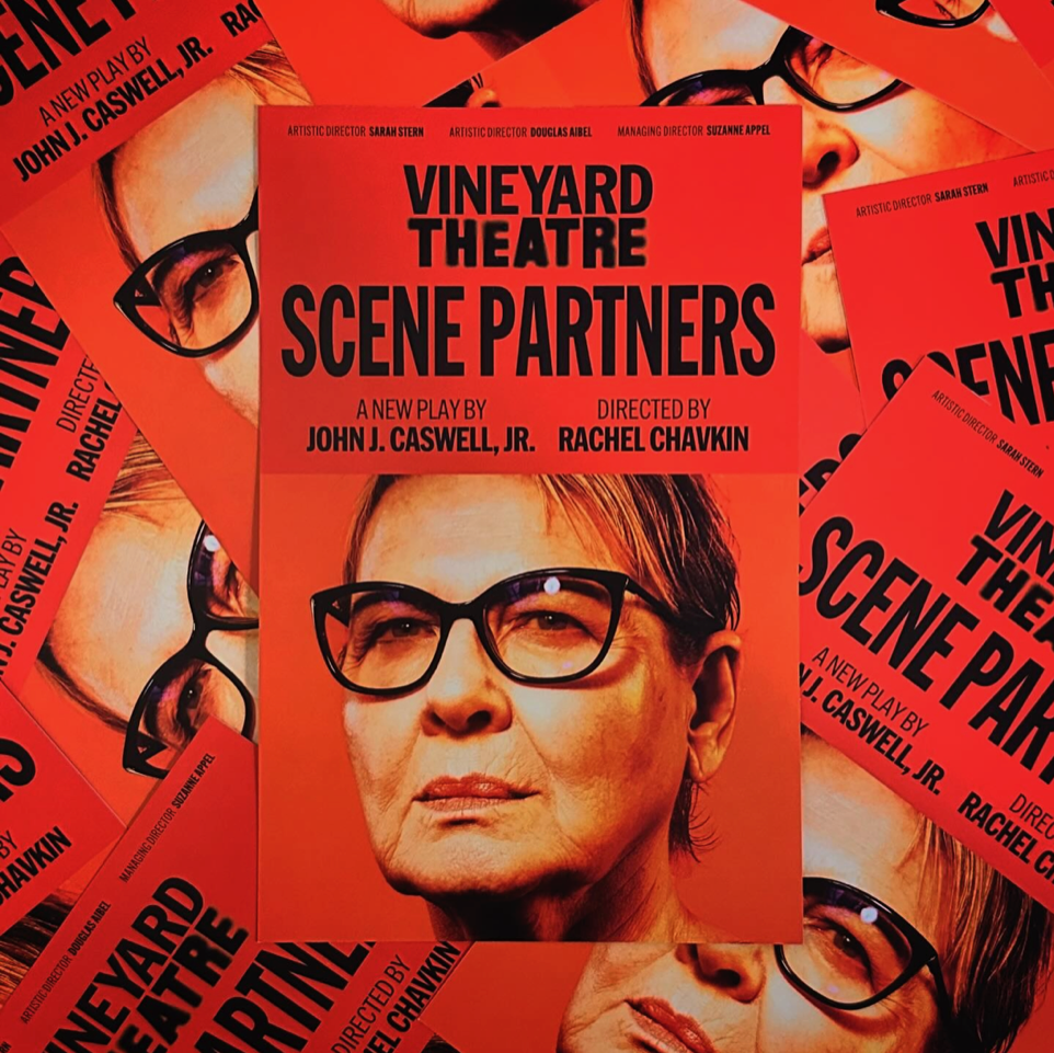
Vineyard worked with NB Studio in London to redesign their identity. With each production, Vineyard strives to change theatre, so the new identity does just that: the color scheme, imagery, and logo are never the same twice; ‘Vineyard’ stays in constant in the wordmark, while ‘Theatre’ is reinvented for each show by a New York designer.
I was honored to be asked by NB to design the ‘Theatre’ logotype for Scene Partners, a new play by John J. Caswell, Jr., starring the incomparable two-time Academy Award winner Dianne Wiest. As a former costume designer, patron of the Vineyard, and having worked on another off-Broadway production poster starring Dianne Wiest, it was a full-circle moment.

Goals
Scene Partners is about 75-year-old Meryl, who ditches ice-cold Milwaukee for sunny Los Angeles, hell-bent on becoming a movie star. She’s got big dreams, a little money, and a whole lot of nerve. Scene Partners is a wildly theatrical, hilarious and genre-twisting gallop through the experience of a woman reborn.
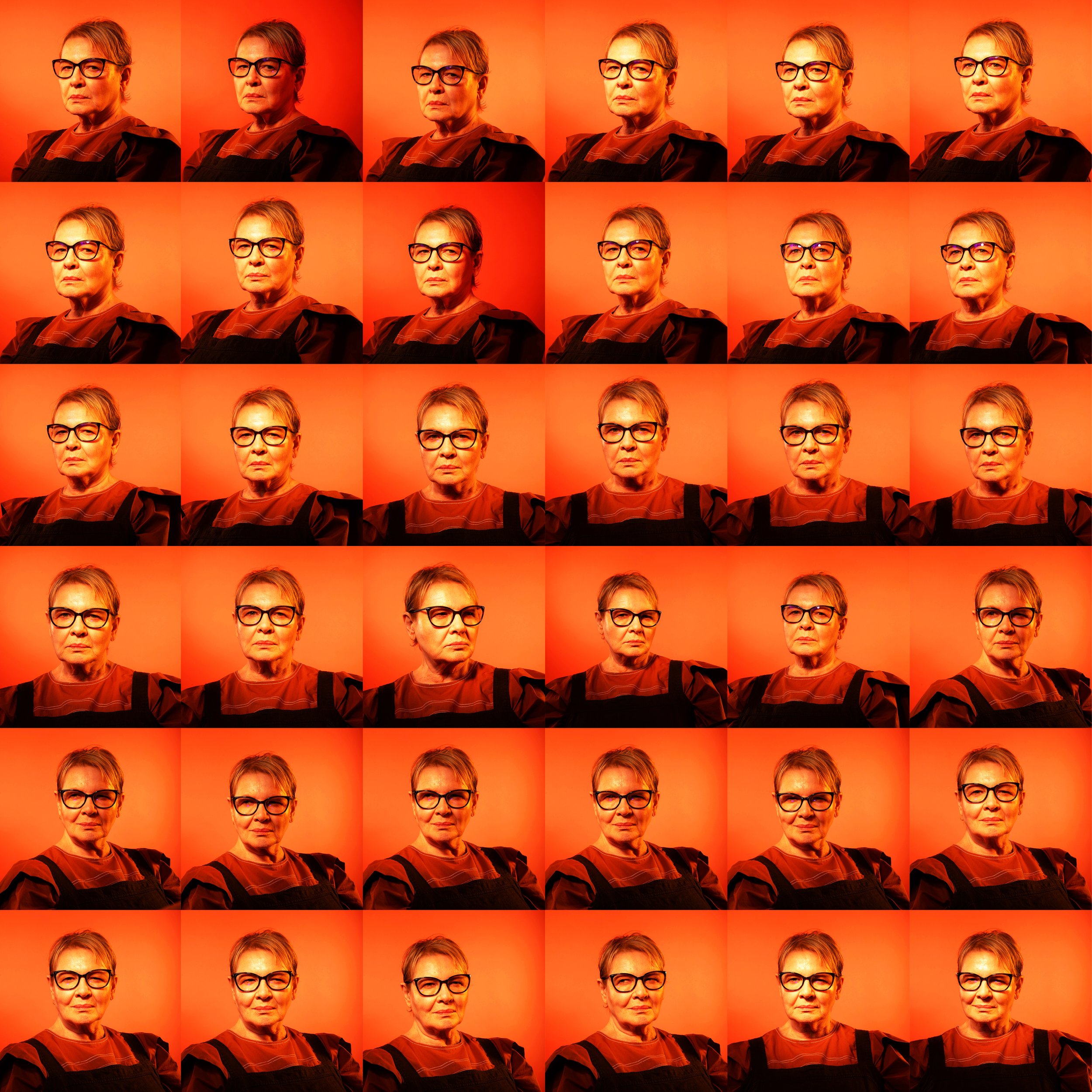
At my kick off with NB, we discussed the chosen direction presented and approved by the Vineyard. The photos had not been shot, but the type had to reflect the theme’s plays of dissociation, imperfection, and Hollywood ambition. NB presented the mood board for the photoshoot, and I in turn made my own for the type.


Experimention
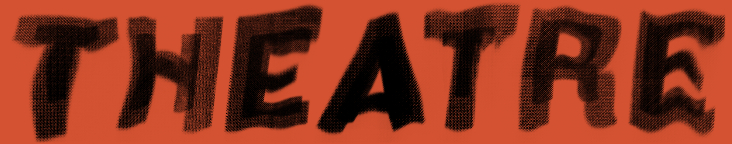
From abstract and hazy treatments to gritty, graffiti-inspired styles, the direction allowed for an incredibly fun session creating dozens of type experiments.


The Final Design
After discussion with NB, the final direction incorporated the classic Hollywood sign font in combination a hazy, diffused type treatment that reflects Meryl’s ambitions, her ever-changing state of mind, and a sun-scorched Los Angeles.
