
Outlive Long and Prosper
New logo and identity for Outlive by Together
by Kate Melvin for Brand New (Original article)
October 24, 2023
Outlive, founded by Harley Courts of Nooklyn in 2023, is a new real estate platform specializing in home sales, vacation rentals, and long-term rentals in Hawaii and New York. Their mission is to do good for both people and the planet. According to their site, Outlive is pledging 1% of all commissions to go toward ocean and forest conservation, planting 100 trees, and removing 10 pounds of pollution from US coastlines for every move Outlive assists. Their goal is to plant 10 million trees by their 10th anniversary. They worked with Brooklyn, New York-based Together to build and launch their brand concept, name, design, and website.
The Outlive team is not your average brokerage. Hawaii and NYC-based, these guys grew up in the waves and on their skateboards, and we knew we needed to bring this spirit into the brand from the beginning. Outlive’s brand strategy weaves together the team’s focuses on wellness, fairness, flexibility, and grit—a brokerage that takes action to bring more people- and planet-centric practices to real estate. Together Project Page
As this is a new company, there isn’t an old logo to review. The new logo, set in Marr Sans from Commercial Type, is a nice, bold condensed sans-serif. I first thought it was Franklin Condensed, and I don’t think I’ve ever disliked any use of Franklin. To be honest, there really isn’t a whole lot to say about it. The more interesting element of the logo suite is the icon, which we also see show up as a whimsical repeating pattern. Two trees come together in a polynesian style to form a house — a delightful if not entirely surprising hidden image. It’s playful and charming and tells a pretty complete story right off the bat: Hawaii and homes.
According to the project page, Together worked with Outlive on the visual system as well as name and brand strategy. As far as the name goes, it works. It gives a subtle double entendre, combining the notion of the Earth (hopefully) “outliving” mankind through sustainable practices coupled with the notion of well, living. The strategy is certainly commendable but I question how much of it is a gimmick. After scouring the website, I couldn’t find specific ways Outlive is “paving new norms in real estate” in a meaningful way. Planting 10 million trees in 10 years and removing pollution for every house sold (or rented) is noble, but many companies do this and have nothing to do with real estate. I expected to find more tangible sustainable practices in their listings, like only featuring solar-powered homes, the use of only low-flow plumbing, homes built entirely in sustainable construction materials… the list goes on.
I acknowledge it’s unrealistic to expect the platform to feature 100% green houses, but maybe a commitment of a certain percentage? But I don’t see that anywhere. If StreetEasy or Apartments.com started planting trees, would they all of a sudden be a real estate platform committed to conservation? Oh, okay, they are also remote. Cool. But again, not really novel or applicable when claiming that you’re reshaping an industry. I know I’m being a bit of a naysayer because their commitments are great. You’re going to remove 10 pounds of sea garbage because I went on vacation? Awesome. And to be fair, they are very new and only have a few listings available. But as someone smack dab in the middle of their demo (Brooklyn-based Millennial who owns way too many Vans), I am also very discerning and want authenticity, so I remain a bit dubious.
Collaborating across teams, an all-star crew came together to make sure the brand design showcased the Outlive team’s real estate experience and expertise, while still being rooted in surf-skate visual culture. A minimalist color palette of black, tan, and an occasional pop of blue offer an earthy yet future-forward vibe. Subtle uses of waves in typography, transitions, and illustrations give a hint to the brand’s pyschedelic, fluid, and natural influences. Together Project Page


The illustrations are of the trendy Gen-Z variety with some hard shadowing and halftone, which add a bit of heft and grounding to an otherwise cartoonish style. They definitely come through on the brand’s promise of skater vibes. While they’re well made and aesthetically pleasing, I find them a bit incongruous with the more interesting icon. The icon’s Polynesian style is only used once and never seen again, which is disappointing. I wish the two elements were combined and that we’d see the nod to Hawaii come out in the illustrations more intentionally. They get there a little bit with the t-shirt design but the rest feel more skater, less tropical. Perhaps they were worried about making the identity look too Hawaiian and ostracizing their New York audience; but I think a happy medium could have been accomplished. Without many applications outside of the website in existence, I hope to see some nuance here as they grow.


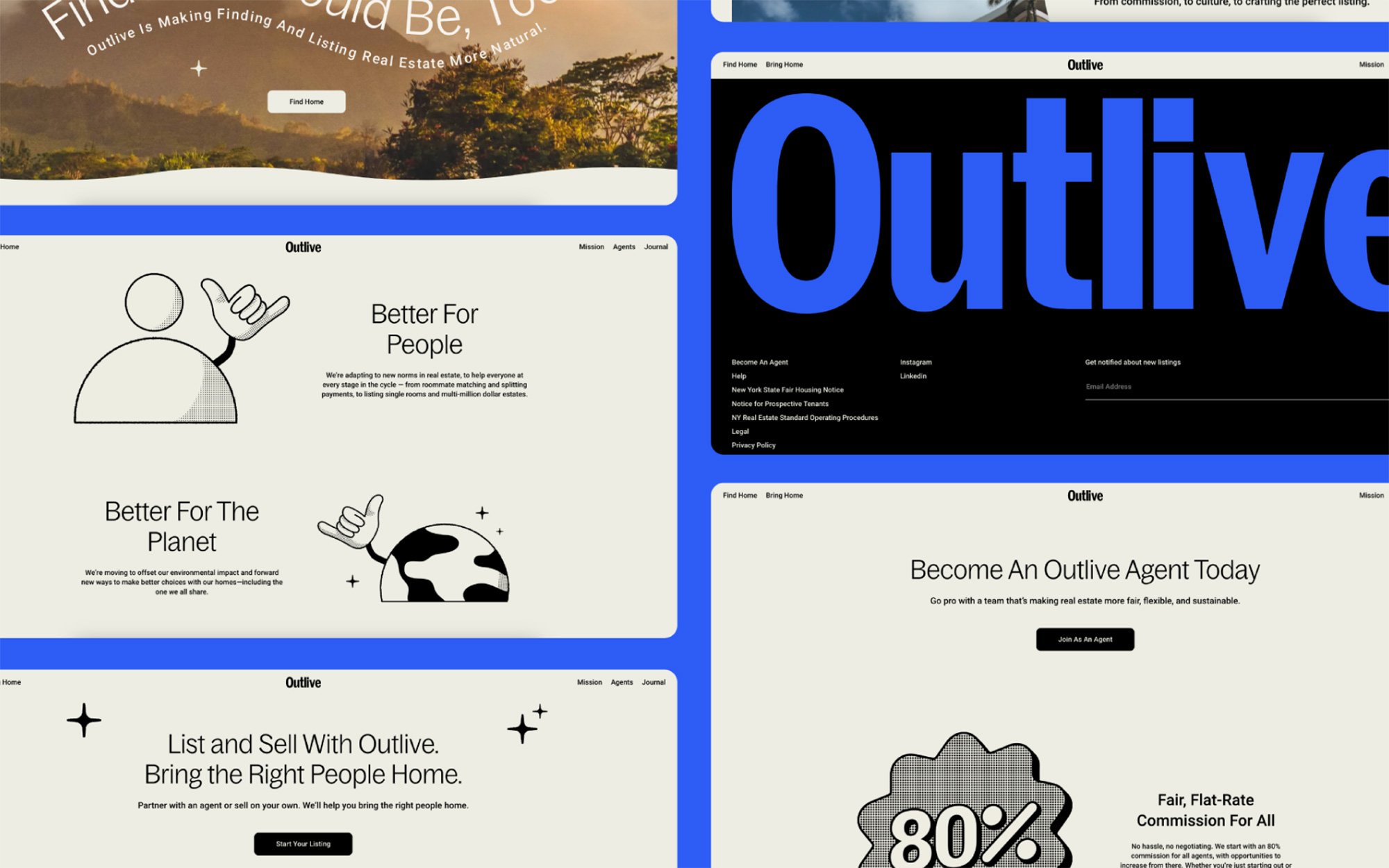
As for the color palette, we’re greeted by our old friend, that blue. As I’ve said in some of my previous reviews on BN, I really love this color. I can’t fault a brand for using it despite its ubiquity. It always feels fresh, modern, and can evoke many different things. That said, Together’s project page describes the palette as “a minimalist color palette of black, tan, and an occasional pop of blue [that offers] an earthy yet future-forward vibe.” I’m seeing a minimal palette of black, blue, and maybe a pop of tan. I guess they’re referring to the sand or that wooden chair in the photography? But I’d argue we don’t see it enough to justify calling it a primary color. This in turn makes the palette not so earthy but much more digital, which is fine since it is a digital product. But that tan element sounds intriguing and might just be the thing that ties the whole identity together.


Overall, Outlive’s new identity is well-crafted with some interesting choices. There are some lovely glimpses of Hawaiian playfulness combined with an urban aesthetic. However, the integration across the system could have been more pronounced and harmonious in order to better tell a more coherent brand narrative. Ultimately, while the promise of conservation is admirable, the claims of their environmental focus seem somewhat detached from their core operations, a disconnect that is reflected in the identity. As Outlive continues to establish its visual presence, let’s hope to see a more authentic representation of its “Aloha-spirit” and green initiatives both in the visuals and strategy to strengthen an otherwise unique and encouraging mission.