
Every Nown and Again
New logo and identity for Nown by Brand Brothers
by Kate Melvin for Brand New (Original article)
August 8, 2023
Nown, previously known as Arktura EMEA, is a group of Amsterdam-based architects, designers, programmers, engineers, and artists, that purport to be the first carbon-negative architectural product manufacturer. The company produces easy-to-install, 100% carbon-neutral ceiling panels, wall panels, partitions, and acoustic baffles. The Nown team produces entirely at their Amsterdam facility using biochar, recycled plastics, and subtractive manufacturing processes. Nown recently introduced a new identity designed by Paris, France-based Brand Brothers.
Brand Brothers was commissioned to create Nown’s entire visual identity, with the mission of telling the story of elevation, precision and obsession with beauty through typography and a complete graphic system… The graphic system revolves around the pivotal angle of the characters to form a series of components that tell the story of Nown products through abstraction, modularity and ease of use.


When I first dive into the identity of a new brand I’m unfamiliar with, I use those critical first impressions to try to guess what the product or company does. If you haven’t read the “about” paragraph yet, go ahead and try to guess. With Nown, I thought maybe they do something with architecture or some cool new type of manufacturing. I was pretty darn close, so we’re off to a good start.
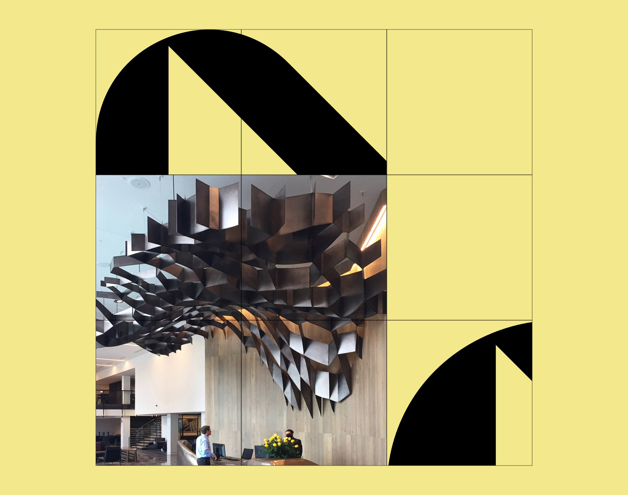
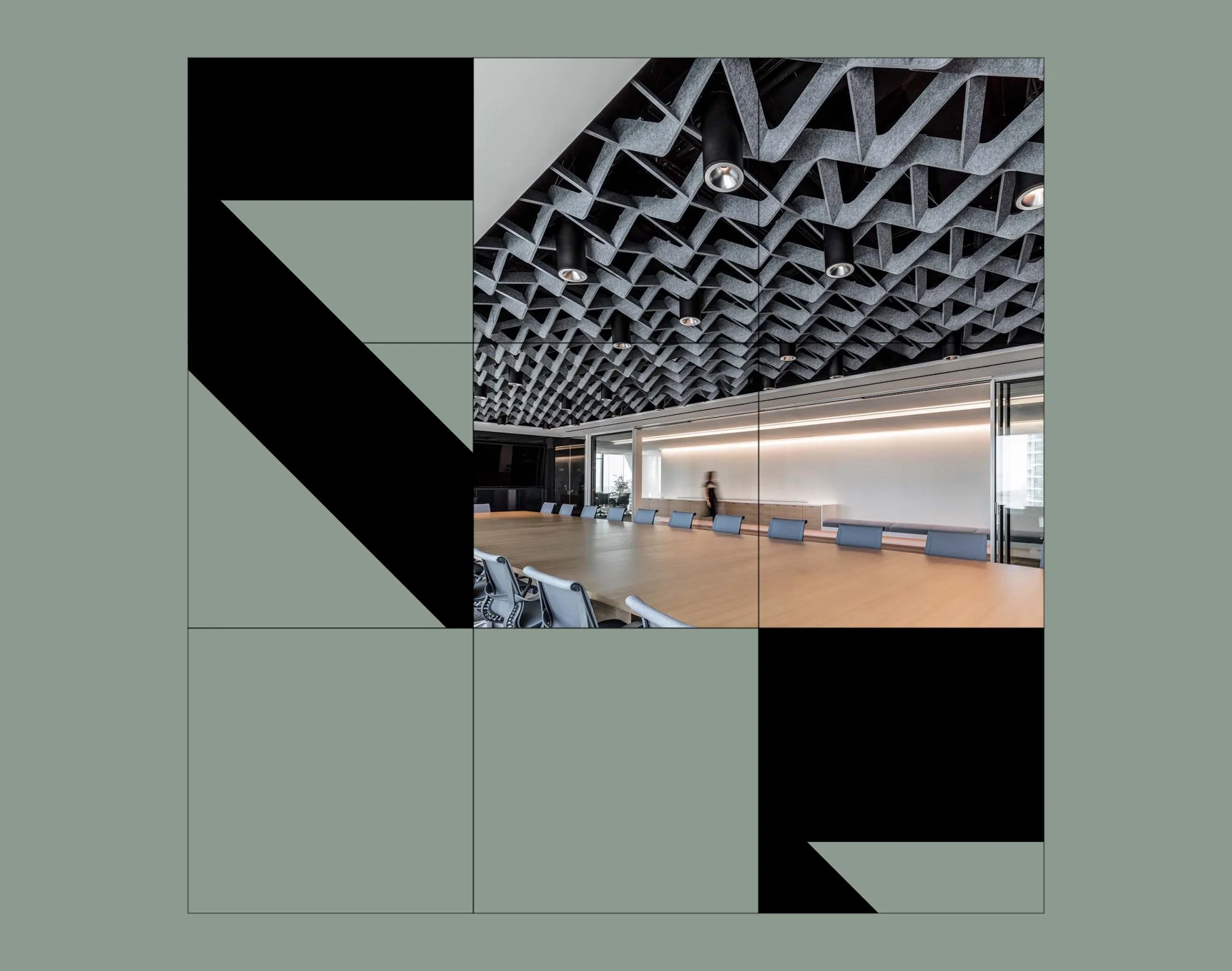
Well, maybe. The logo immediately gives Y2K tech vibes and made me think of the former Nokia logo with its sharp angles and rectangular “O.” (But hey, at least they’re fully constructed letters.) For that reason, I wasn’t drawn to it, but could be swayed with the right storytelling. After some digging and exploration through the visual system, I’m convinced: it’s pretty cool. The logo is completely custom and precisely created in a way that mostly lives up to the graphic showing its construction, unlike many logos that are presented with a construction grid that was obviously created after the fact for the case study. When you pair it with the photography of the wavy ceiling beams or jagged wall panels, it all comes together. I couldn’t find any information on the change from Arktura, nor anything about what “Nown” means or how it’s pronounced. For the sake of this post’s title, I hope I’ve got it right in saying it like, “noun.” Who knows. (Oh wait, is it pronounced “known”?)
The logo’s extreme width might be a problem in terms of scaling it up or down but seems to work for the most part, even in small applications like a swatch label. The shorthand, on the other hand, doesn’t work so well. It’s cool to see the reflection of the “W” in the construction of the “N”s but it falls apart with the sharp arm jutting out of the “W”. That said, the shorthand seems to get no use in the applications, so perhaps this was more of an afterthought. [EDIT: Scratch that! Brand Brothers let us know this is not a shorthand version of the logotype, just a close up of the letter construction.]


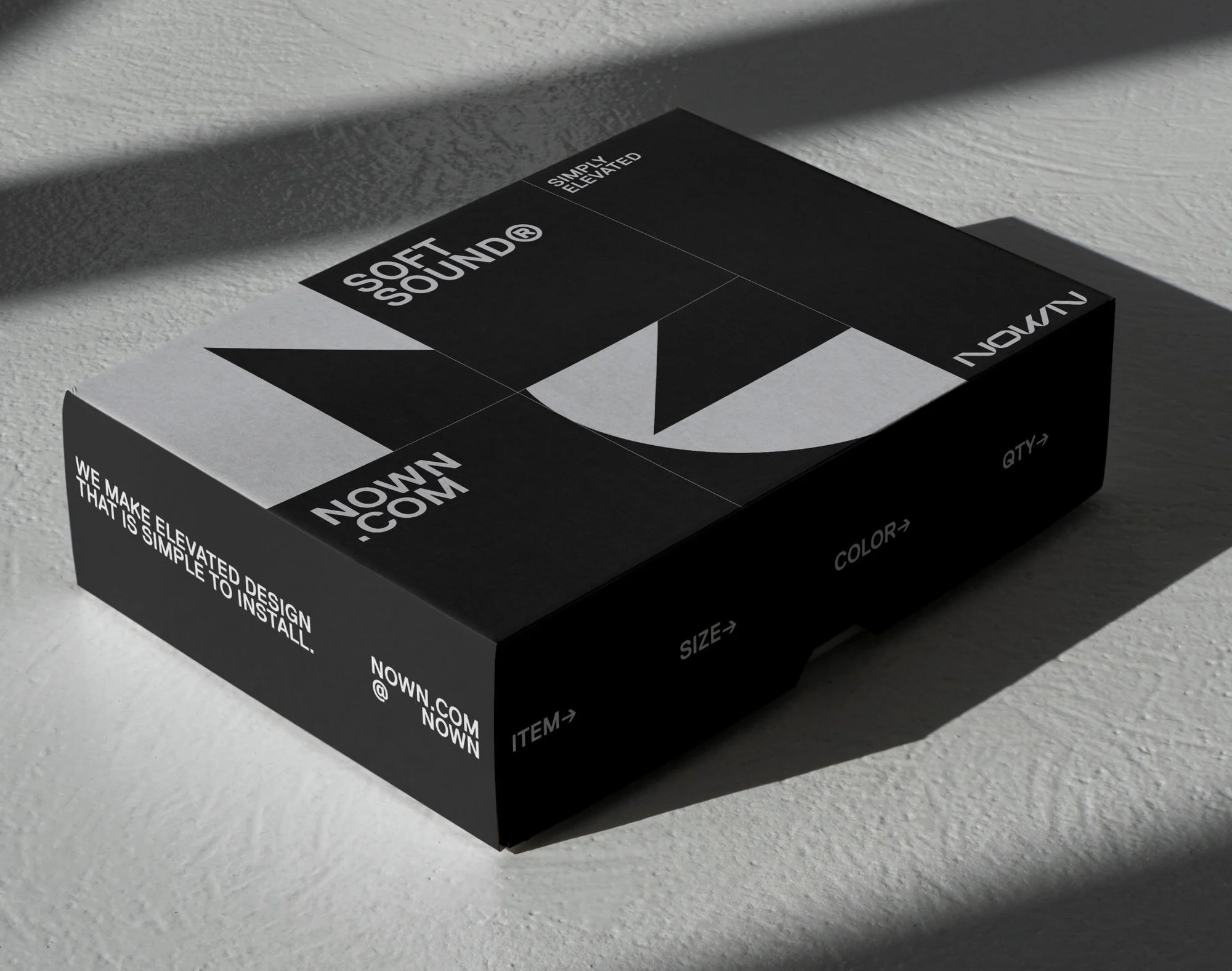
As a designer, I love a good graphic system. Give me a grid, components, and a few rules and I’ll happily spend the day making assets. While Nown’s graphic system is intriguing, with some funky shapes created from a corner of the “N,” the system sort of stops there. The rules seem to be square grid + photo + a shape or two. The materials and texture books don’t even follow it all that precisely (note the rounded squares) and we only see one additional use of it on the box. The tubular packaging, for example, is so out of place and boring. But imagine it with a pattern or custom sculptural graphic that mimics the ceiling panels or partitions. Heck, just copy and paste the grid of all of the components together and there ya go.


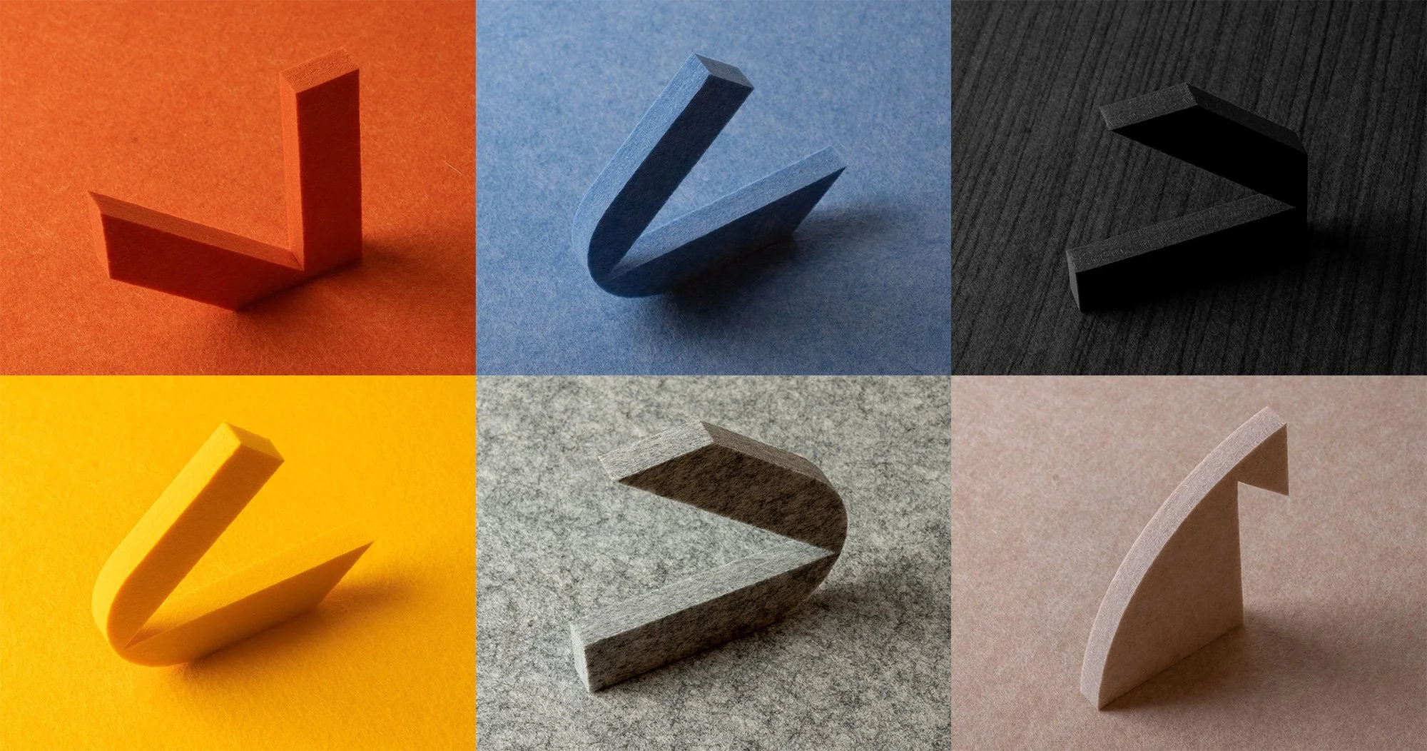
The color palette is mostly under-saturated with just enough pops of a bright blue or pastel green here and there to liven up the identity without overpowering the product itself. Though the materials come in bright colors like cherry red and butter yellow, most of the photography shows neutrals and metallics. Anything brighter in the graphic design would have sent the wrong message.


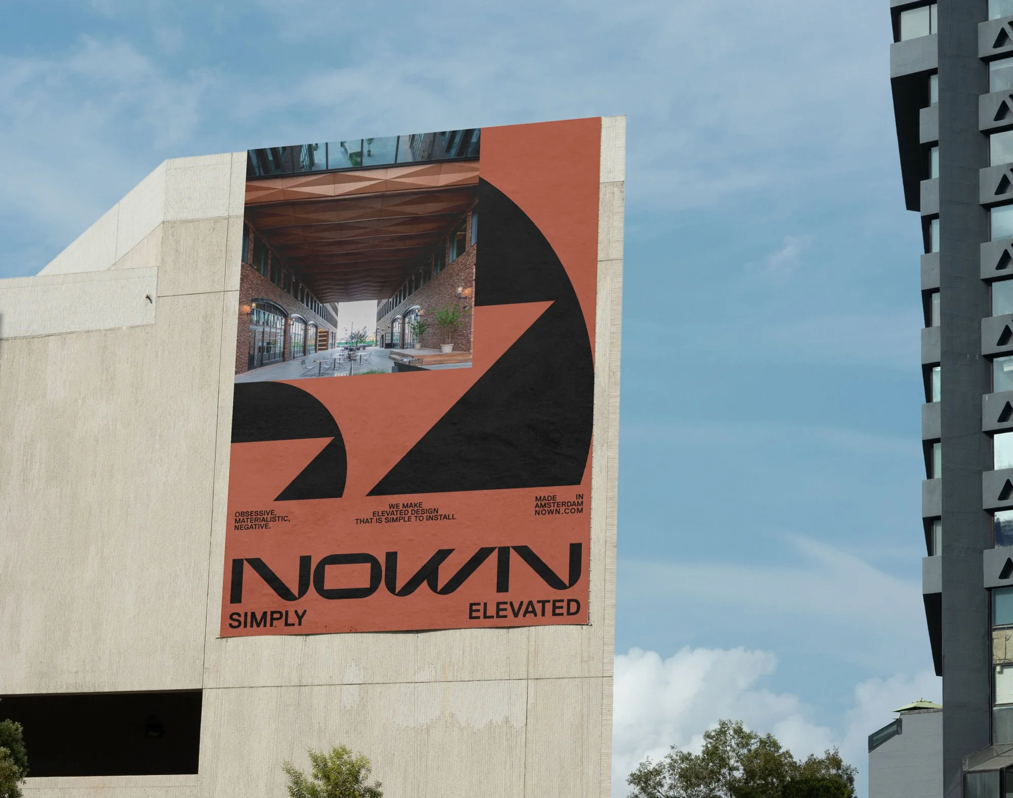
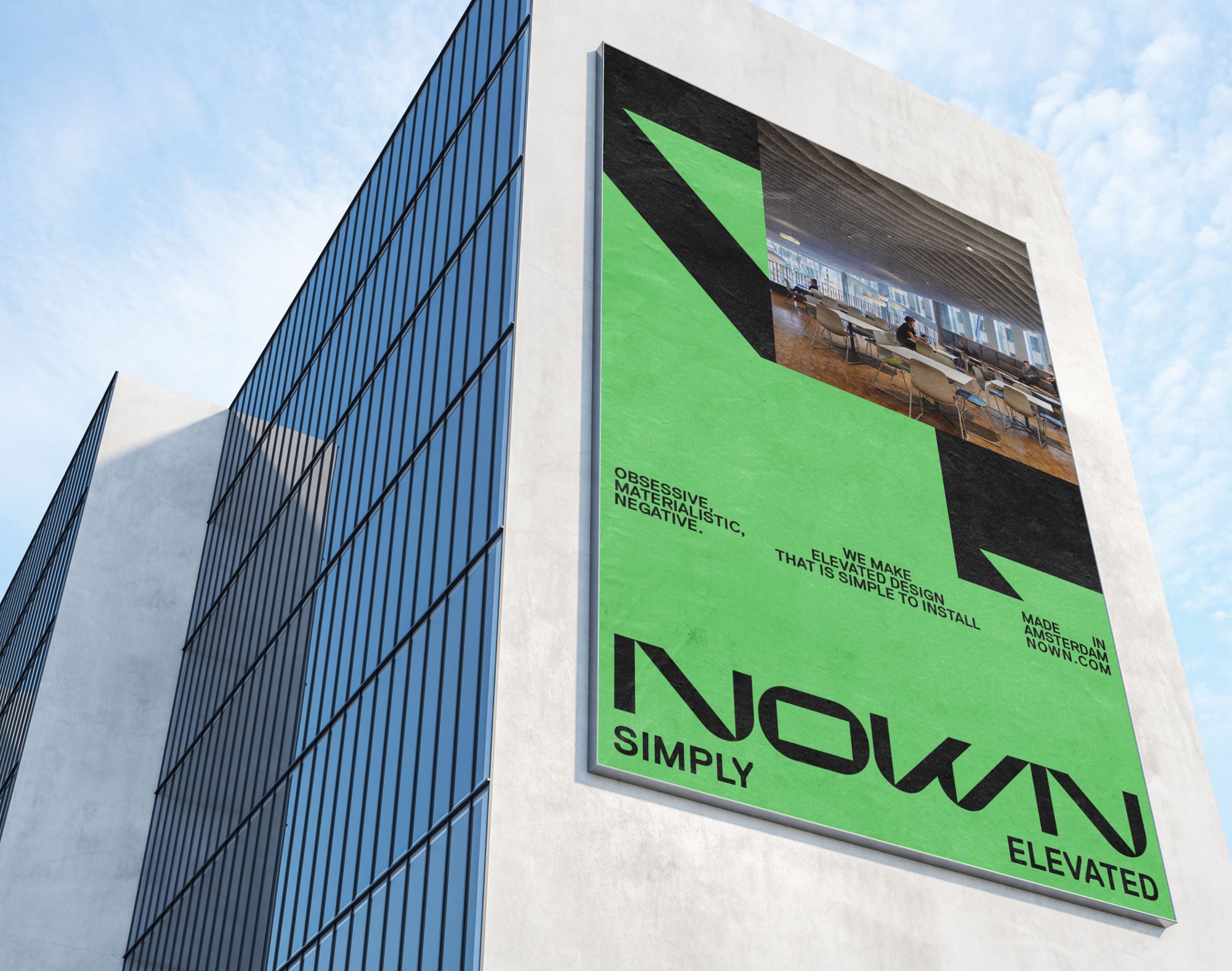
We do see the system in use in advertisements, which are enticing. The thing I especially like about them is the copyline, “We make elevated design that is simple to install.” Now that is human and helpful. I know exactly what your product is and am interested, even as someone completely outside the architecture industry. Like, can I install this in my living room?! The ad gets me to the website to answer that question. Boom, successful marketing.
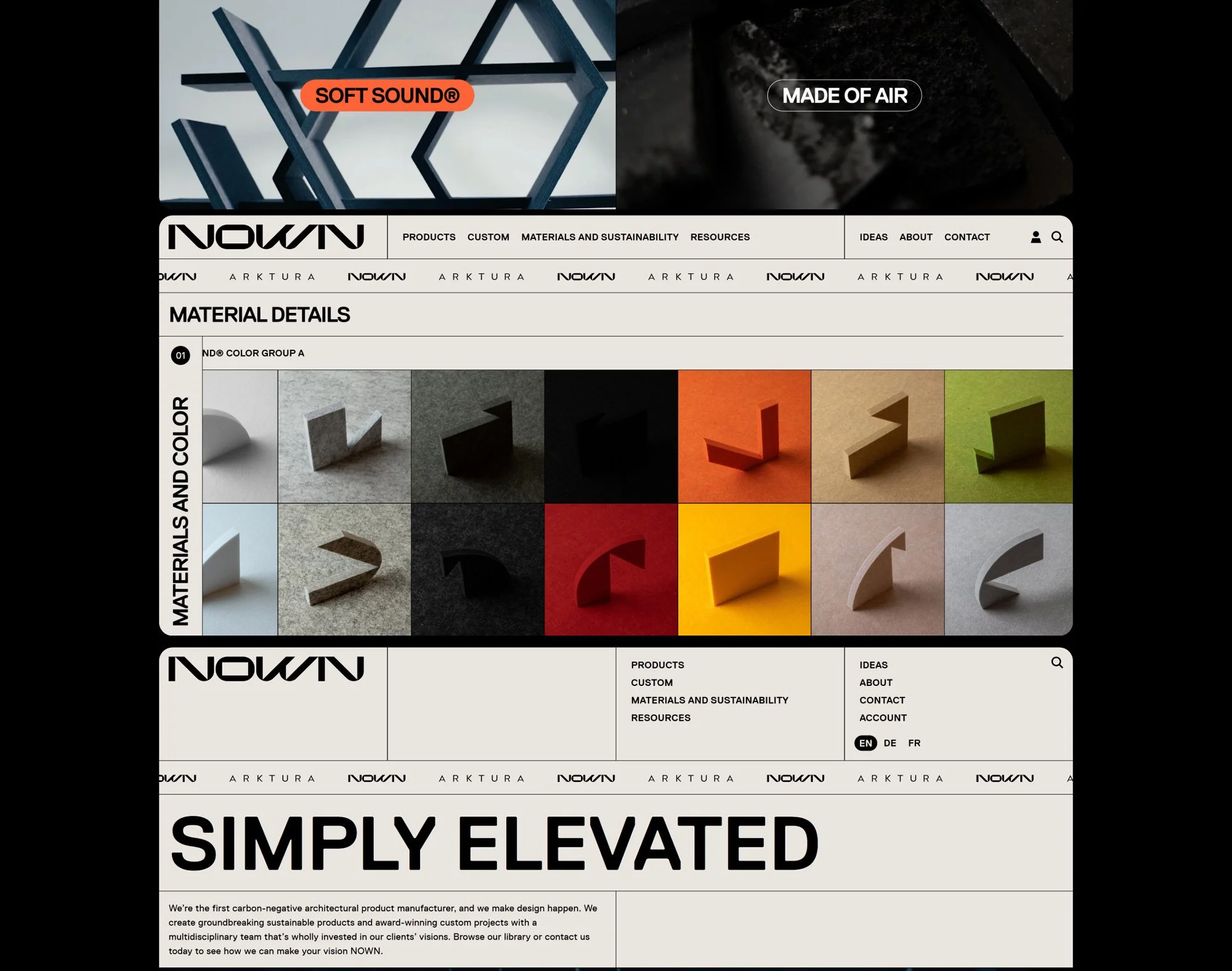

The website itself is a bit intimidating in its hyper-stylized layout, but after a few clicks, it’s actually deceptively simple and easy to use. I particularly love the journey of learning about a product. The layout itself might be intricate, but it’s balanced with straightforward illustrations and information. “Each module is made from a minimum of 488 recycled water bottles, [depending] on size and configuration.” This line sits atop a photo of plastic bottles. Clear and simple.

Nown’s identity may not be everyone’s cup of tea. The logo is unusual and the system can look quite busy. With the reasonable temptation to keep a complicated product’s identity simple, I’m glad they went in the opposite direction. Brand Brothers could have easily made the logo from Replica and it would have been more interesting than a lot of what’s out there. But they took the extra step of eccentricity, which tells a more compelling story and better represents the company for which it was made. I predict some debate in the comments, but give me unconventional and polarizing over safe but acceptable any day.